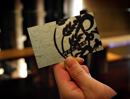
Business cards are an inexpensive and highly effective marketing tool. However, as quickly as business cards can be used to assist in networking, they can also be just as quickly discarded if the card lacks any reason to get the individual noticed. There are many ideas such as unique colors, business card translation, or creative designs that can really make a positive impression. Thus, we’ve created some simple tips and ideas to bring your business card to the next level.
Use Appropriate Graphics For your Industry
It’s important for your business card to be creative, however, know your industry. A whimsical or playful business card design may not appeal to those in the banking industry. Thus, one should play to the strengths of their business. For more reserved businesses, apply clean but creative uses of typography or upgraded card stocks instead of zany colors. For more creative businesses like web design, the sky’s the limit. Use designs that offer an impact, or even die cuts and/or plastic materials that will really make the very shape and texture of your card stand out.
Don’t Waste The Back of Your Business Card
Instead of leaving the back of your business card blank, utilize that space! An impressive way to get noticed and potentially draw in more business is you have your business card translated. Even if you do not speak a foreign language, you may serve a community that does. For example, a retail establishment near Japan Town could benefit from having Japanese business cards translated and printed on the back. The same could hold true for Chinese translated business cards serving the Chinese community, and so on. This gives you the option to present your card with the translated side up, simply to get people talking. It also gives your business a professional global feel to leave a positive impression on your potential clients.
Sometimes Less Is More
Since business card real estate is limited, many people try to cram as much information as they can onto the face of the card, thinking they are doing themselves a favor. Rethink this. If your office has two locations, and you want to include both full mailing addresses, along with your cell, fax, main, direct, BB, skype, web site, company name, tag line and logo, you’re going to have an incredible amount of information to fit in a small space. What does that mean? Usually this will translate to font sizes so small that they are nearly illegible. In most cases, try to avoid font sizes below 7pt in size. Also, negative space around your logo is important as well. It assists for branding to make your company image clear and clean. Thus, don’t have text running too close to your logo, and edit down personal information so that all text is clear and concise.
For more information, please visit our Frequently Asked Questions page for ordering translated business cards.
You can also use our express FREE Asian Business Card Translation Quote Request Form to select your options and receive a detailed quote for your exact order.
_________________________________________________
AsianBusinessCards.com
Japanese, Chinese & Korean Business Card Translation, Typesetting & Printing Experts


